Why I included this project.
During this project I learned an important lesson: Not to keep searching for the ‘perfect solution to start with’. I kept searching for the moment I would jump up and scream: “This is it! This is the right concept.” That moment never came, until I actually started with one of my initial thoughts: “What if I pour different kinds of paint over different objects, like fruits?” It turned out this was the concept I was looking all along.
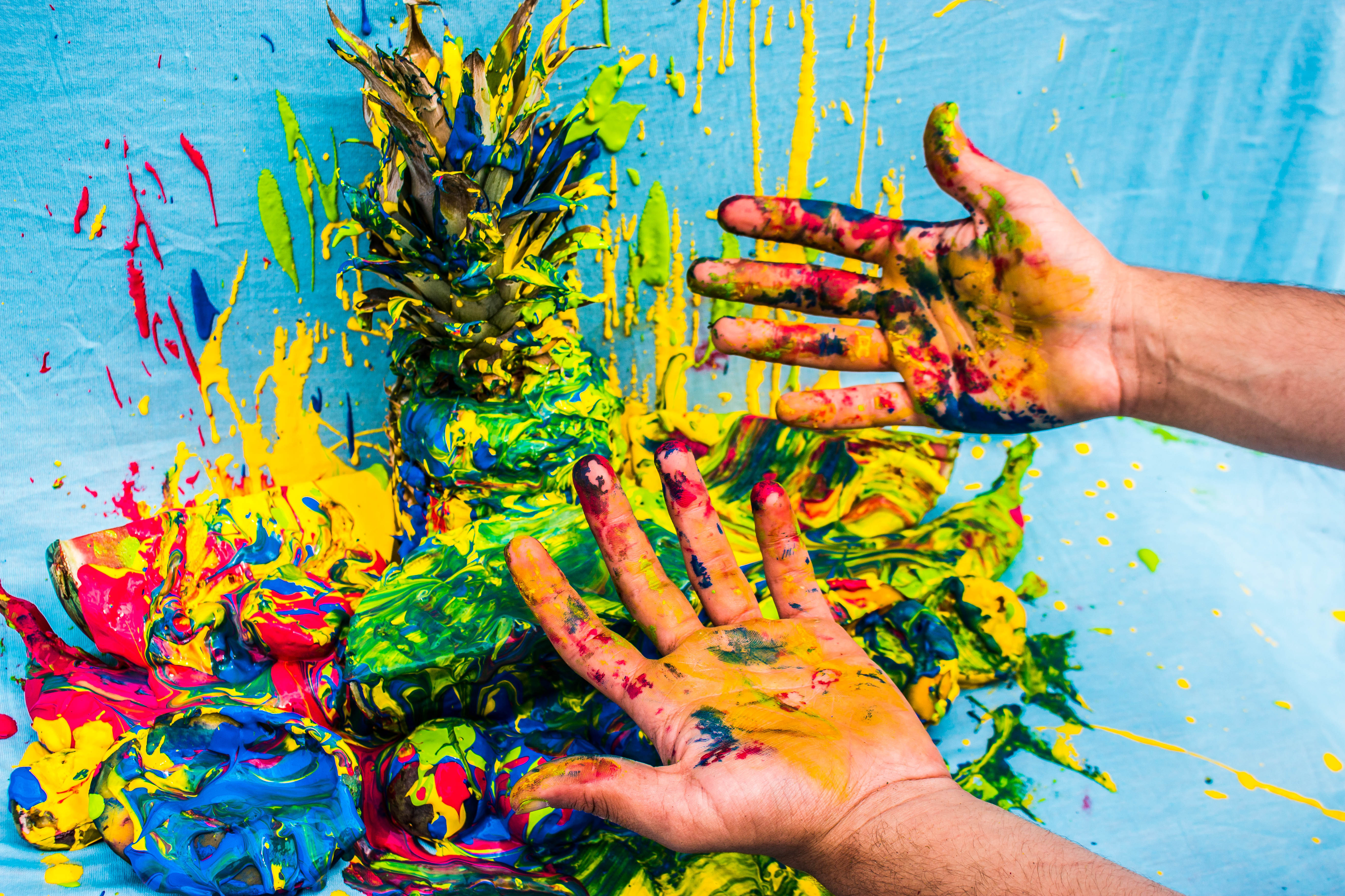
Researching the concept.
The concept is focussed around the importance of “flow” in Eli’s music and style. Combined with the sound of his music, this resulted in the vague idea of dripping paint or liquid over different fruits. To research this I experimented with a pineapple, some random objects, paint and laundry detergent.
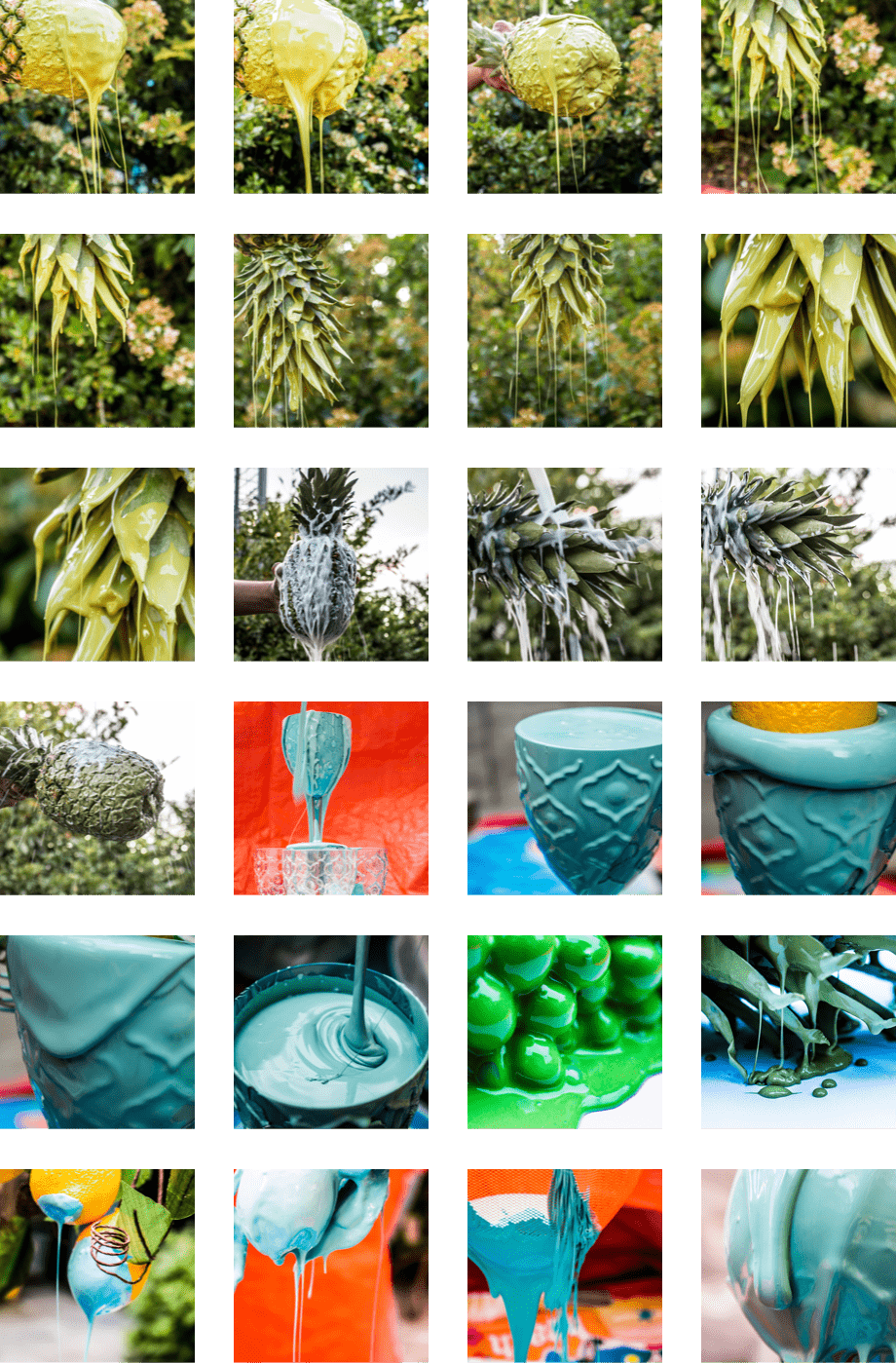
Expanding the concept.
After experimenting with the first round I decided it was time for more fruits and more paint.
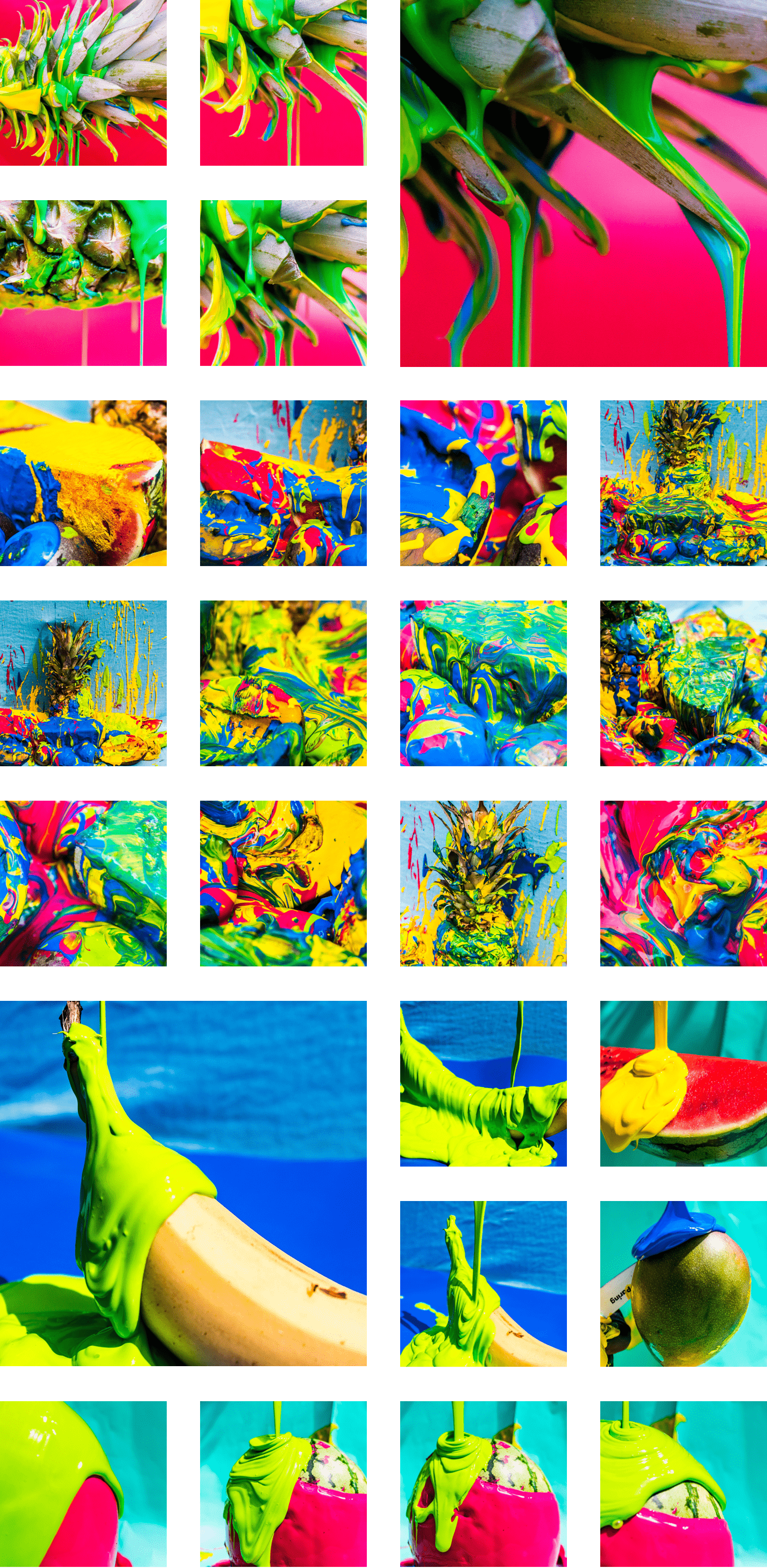
Creating touchpoints.
The visual of tropical fruits dripping in paint added a layer of appeal to Eli’s flow concept. The very bright and colorful images delivered a strong selection of images ready to be used in the visual language. This concept resulted in the following touchpoints.
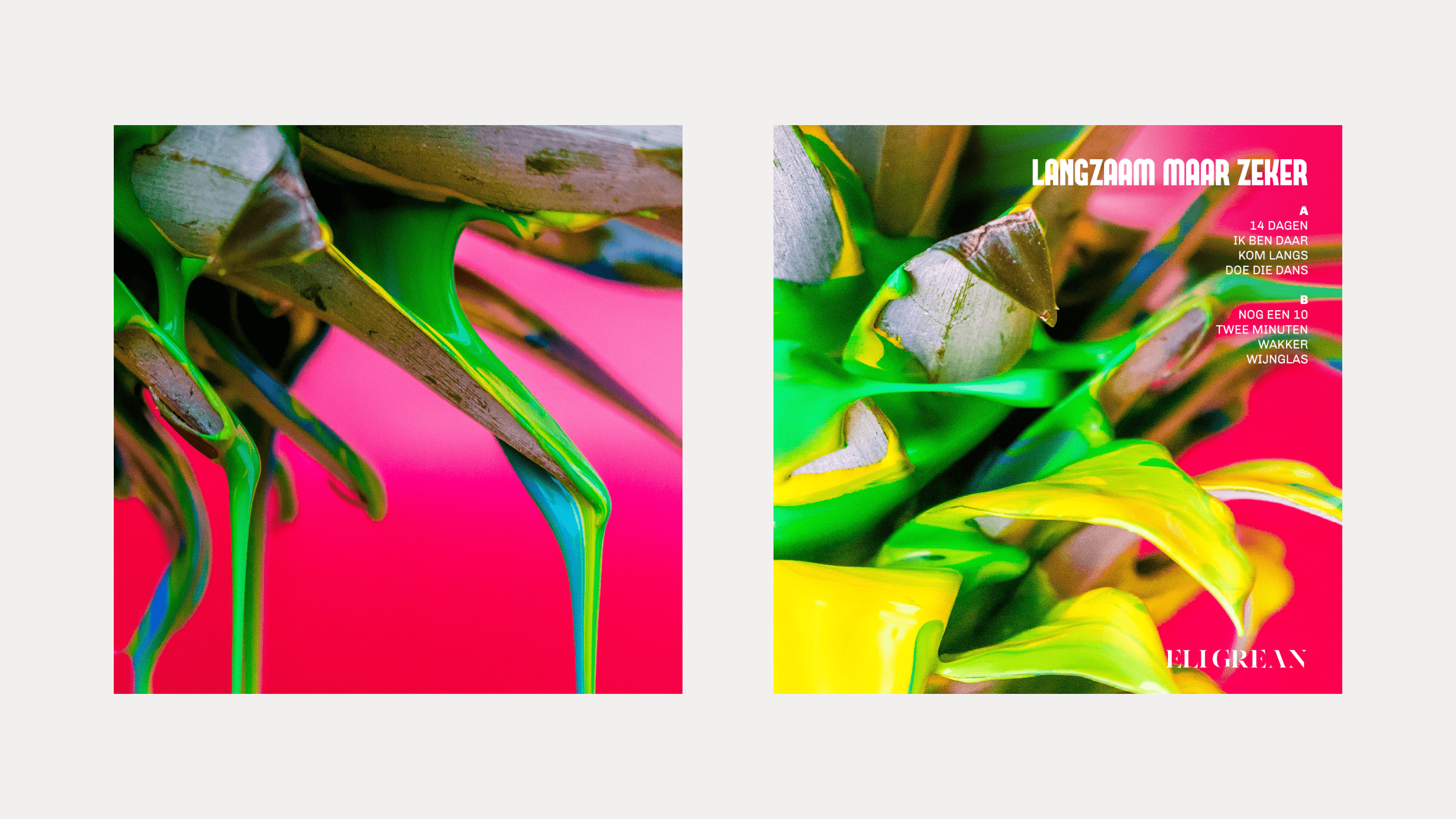
LP Cover. Left: cover, right: back
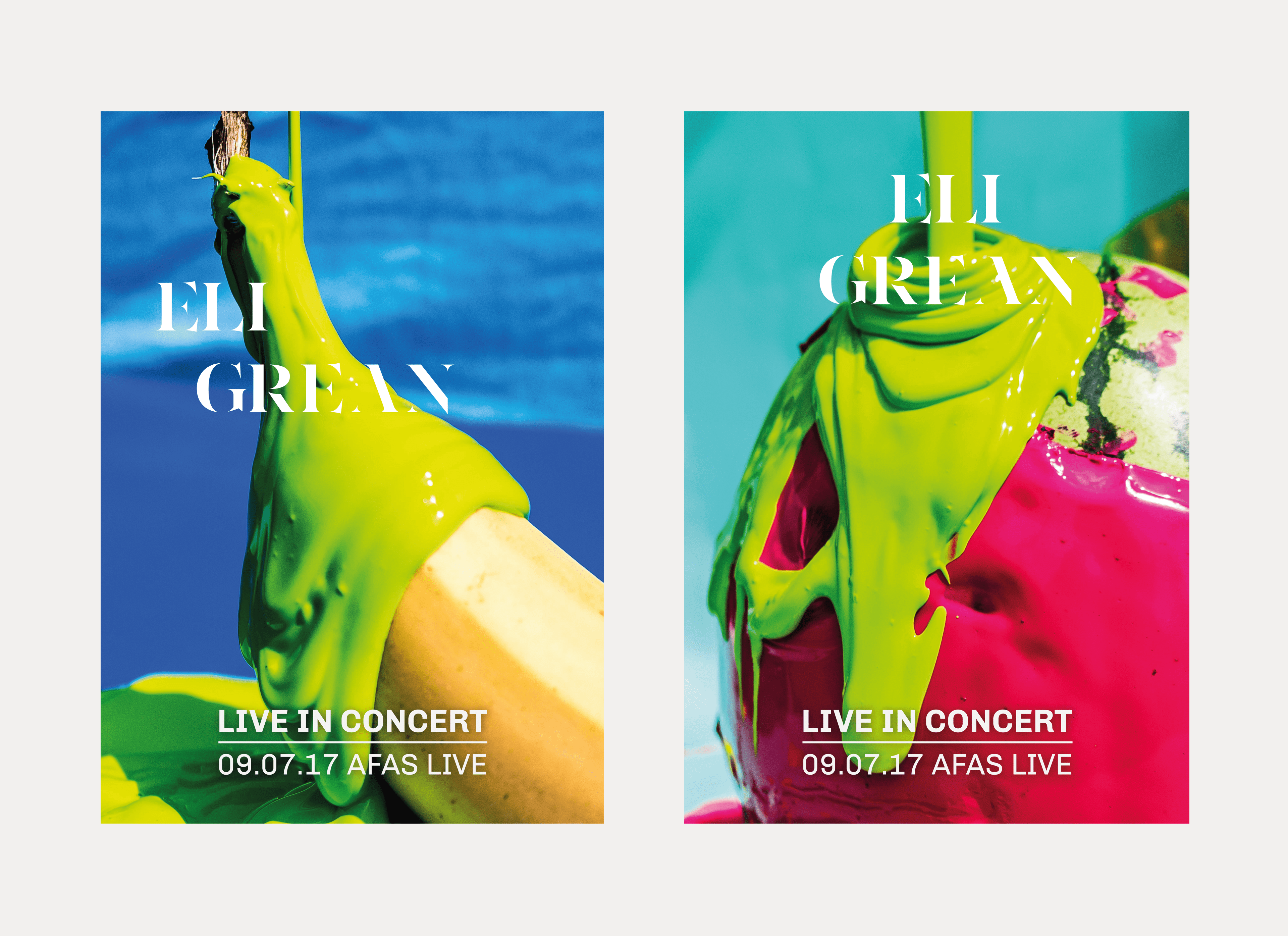
Concert posters
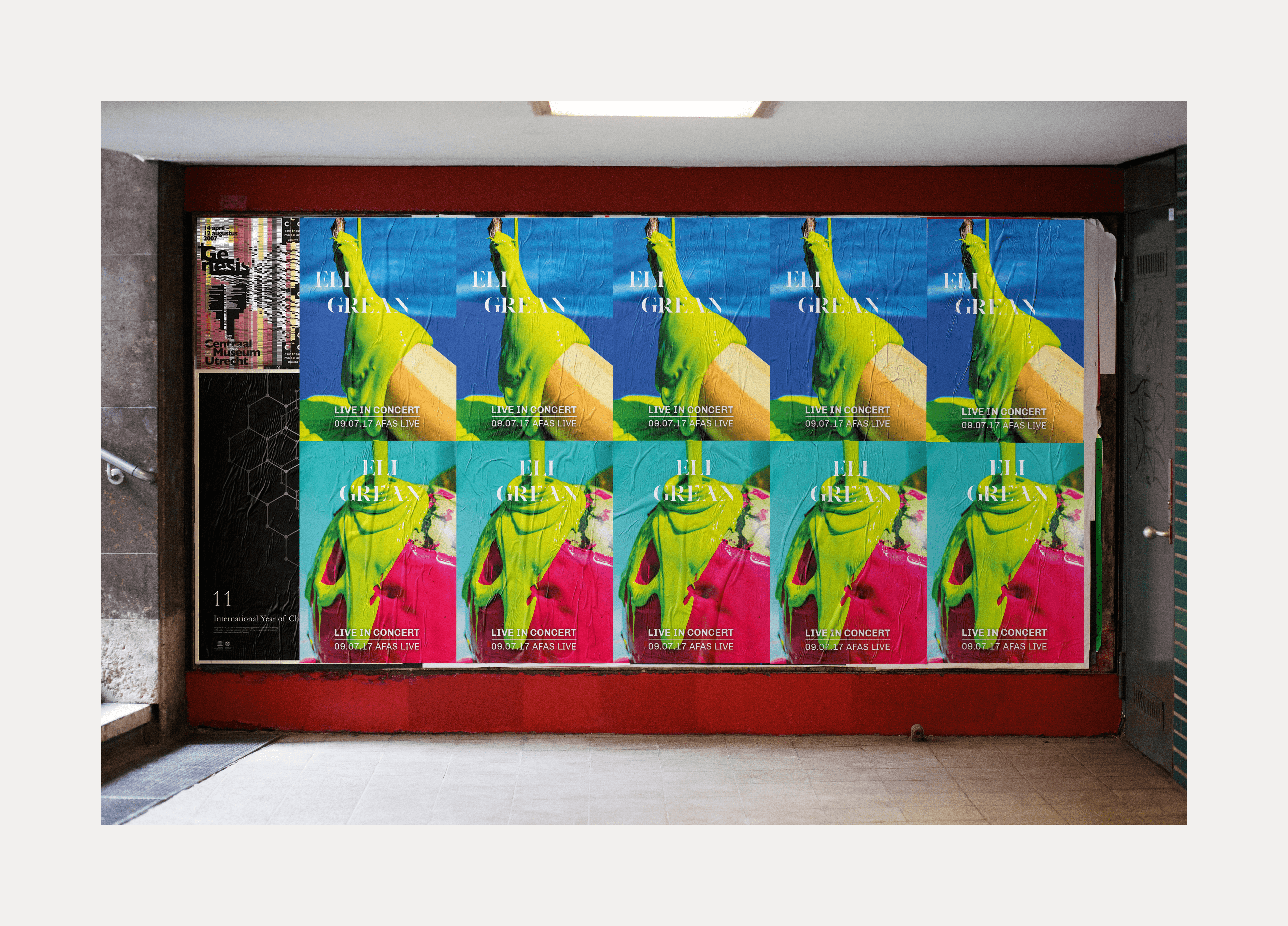
Posters in context
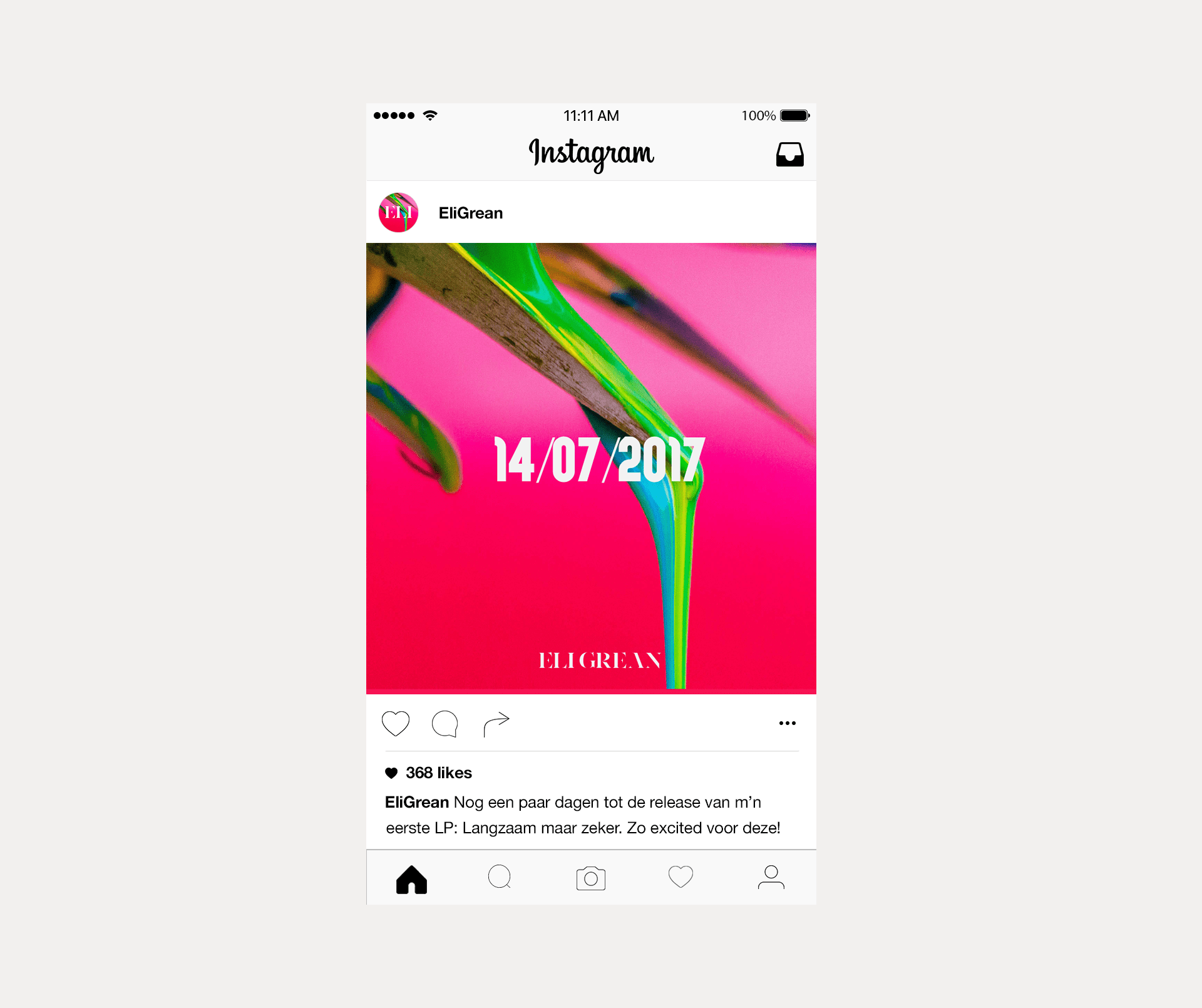
Online Banner